Pictorial displays are another way of describing data sets.
1 A Histogram is very common method of displaying data. It places the classes of a frequency distribution on the horizontal axis, and the frequencies on the vertical axis. The area in each rectangular bar is proportional to the frequency in that class. See Figure 2.1.
2 A Frequency polygon expresses the distribution of the data by means of a single line determined by the midpoints of the classes. See Figure.2.2. it is common practice to extend both ends of the frequency polygon to the horizontal axis at those points that would be the midpoints of the adjacent classes at each end. Thus, if a class preceded the first class of 50 to 59, it would have boundaries of 40 to 49 with a midpoint of 44.5. similarly, if the last class of 100 to 109 were followed by another class, it would have boundaries of 110 to 119 and a midpoint 114.5.

Figure 2.1 – Histograms for P&P’s Passengers

Figure 2.2 – Frequency polygon for P&P’s Passengers
3 The information shown in a lees-than cumulative frequency distribution and a more-than cumulative frequency distribution can also be displayed pictorially. Such a graph is called an Ogive and is shown in Figure 2.3. the less-than ogive shows that on 3 days, less than 60 passengers flew P&P Airlines, and the more-than ogive reveals that on 47 days, more than 59 (60 or more) travelers boarded flights with P&P.

Figure 2.3 – Ogives for Passengers Data
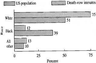
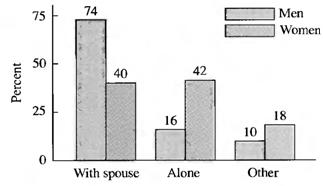
4 A Bar chart presents data in a manner similar to a histogram. The main difference is that the bar chart need not show frequencies on the axis, but may be presented horizontally or vertically. See Figure 2.4. it is possible to show more that one value at a time on a bar chart. Figure 2.5 displays the revenues and costs for P&P Airlines. Figure 2.6 provides further examples of the use of bar charts.
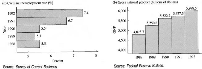
Figure 2.4 – Bar charts for Performance of the US Economy
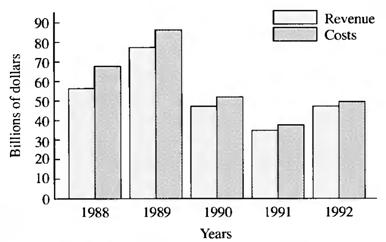
Figure 2.5 – P&P Performance
|
A |
B |
|
Figure 2.6 – Common Uses of Bar Charts: A – Percent of US population and death-row inmates by race; B – Living arrangements of people 65 years and older | |
|
C |
Figure 2.6 – Common Uses of Bar Charts: C – Winning percentages of 1991 divisional winners in national football league (continuation)
Figure 2.7 contains Stacked bar charts, which provide a different look at the use of the displays on Figures 2.4 – 2.6.
|
A |
B |
Figure 2.7 – Stacked Bar Charts: A – Championship teams since 1946;
B – Where to put your money: advice from investment firms
5 A Pie chart presents the data in the form of circle. The slices represent the absolute or relative (percentage) proportions. Pie charts are quite useful for displaying relative differences among observations, and they are particularly appropriate for illustrating percentage differences. A pie chart is formed by marking off a portion of the pie corresponding to each characteristic being displayed.
To ensure that the pie is properly portioned, each percentage is multiplied by the 360 degrees in a circle. If the values are not already in percentages, it is necessary to convert them to percentages to determine the appropriate number of degrees.
Table 2.11 contains the appropriate breakdown for the characteristics of the nation’s work force taken from an edition of The Wall Street Journal. For example, the 48 percent of all workers who never take work home converts to 172.8 degrees. The remaining portions are similarly calculated and the resulting pie chart is shown in Figure 2.8
Table 2.11 – Working Habits of the US Labor Force
|
How Often Employees Take Work Home |
Proportions (%) |
Degrees |
|
Never |
48 |
360 * 0.48 = 172.8 |
|
Less than once a month |
10 |
360 * 0.10 = 36.0 |
|
Once per month |
12 |
360 * 0.12 = 43.2 |
|
Twice per week |
9 |
360 * 0.09 = 32.4 |
|
3 – 4 times per week |
8 |
360 * 0.08 = 28.8 |
|
Every day |
13 |
360 * 0.13 = 46.8 |
|
Total |
100 |
360.0 |

Figure 2.8 – Pie Chart
6 Since much of the business and economic data statisticians work with is measured over time, a Line chart is useful because it permits us to express units of time on the horizontal axis. A line chart for the unemployment rate in the US is shown in Figure 2.9.
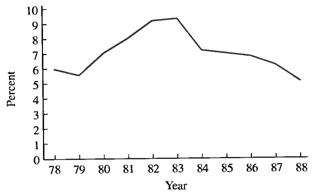
Figure 2.9 – US Unemployment Rate
7 Financial data are often displayed with the aid of a High – low – close chart (Or Ticks and tabs). It displays the highest value, the lowest value, and the closing value for a selected variable during a given time period. The most well – recognized example is the Down Jones averages found daily in The Wall Street Journal (WSJ). See Figure 2.10.
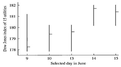
Figure 2.10 – The Dow Jones Average for 15 Utilities on Selected Days in June
The upper end of the vertical line, or Tick, marks off the highest value that the index reached on that day; the lowest end of a tick indicates the lowest value of the day. The closing value is shown by the little Tab in between.
